|
|
|||||||||||||||||||||||||||||||||||
|
XML Defined Controllers All MIDI controller screens can be customized regarding the controls they show, the MIDI they generate and their visual appearance. User customizations 'live' in the currently selected XML document and are stored within it. Controller definitions for seperate parts can also be imported, exported and shared individually. All customizable screens are edited in the same way. User-defineable controllers all run on the exact same code. Screens are equivalent in what they can (and can not) do. Presets are generally interchangeable - you can load a secondary keyboard preset into the Big Time screen, build your own DAW controller to replace the XY-Pads or have all four of them show different pages of a homegrown synth-controller. Edit Mode  To start editing select "Edit" from the menu. This will bring up a dialog with multiple tabs covering things like MIDI, colors, text, layout etc. and is discussed in more detail below. To start editing select "Edit" from the menu. This will bring up a dialog with multiple tabs covering things like MIDI, colors, text, layout etc. and is discussed in more detail below.
 Some additional functionality is given in the dialog's header: The title that indicates the edited control provides a link to the app's XML Editor. When you touch it, the xml will be shown scrolled to the highlighted representation of the currently edited component. Edits can generally be done via the dialog UI or directly in the xml. Do look at the xml code at some point! Even if it may be scarry initially, it is perfectly human readable and can help a lot in understanding how layouts are build. Writing controllers, especially defining initial overall structures, will also be a lot easier and faster when done in a text editor. If a hardware keyboard is connected, 'Ctrl-E' will enter and exit edit mode. 'Ctrl-Shift-E' breaks directly into the XML editor.
The Trigram symbol ( ☳ ) in the middle of the dialog's header can be used to move the dialog around as it will of course obstruct a good part of the screen especially on phones.
Edits will only take effect and be written to the xml document when confirmed with the OK button. Multiple components can be edited before confirming, though. Use the "Done" button, double-tap the screen's background or touch the screen's menu again to exit edit mode. (Note that simply exiting edit mode will NOT confirm edits!) When working on the xml itself, use the "(Save And) Close" menu entries to exit the XML editor and confirm your edits. "Close" or just 'backing' out of the editor cancels edits without confirming them.
The 'Editor Style' menu in the XML view has options to set text-size, toolbar shortcuts, show line-numbers etc.
If you are on an older device and find the editor to be lagging, try turning off syntax highlighting. 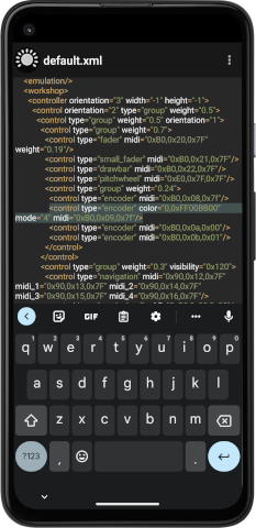 |
|||||||||||||||||||||||||||||||||||
|
Selecting Components   To change the selection either touch another control or use the arrow buttons in the dialog's header, resp. the left / right arrow keys on an attached hardware keyboard to step through controls. |
|||||||||||||||||||||||||||||||||||
|
Selecting groups  If you touch the currently selected control again, selection will change to the group the control lives in. If you touch the currently selected control again, selection will change to the group the control lives in.
|
|||||||||||||||||||||||||||||||||||
 The next touch selects the group's enclosing group. The next touch selects the group's enclosing group.
|
|||||||||||||||||||||||||||||||||||
 Etc... Etc...
This will go up all the way until the top level of the controller is selected before it will start with the originally selected control again. To interrupt the proceeding touch some other control. Groups in the end are just simple layout containers, but can mostly be handled like other controls: They have their own color and layout related properties and once selected can be removed or be exchanged against other controls via the "Control" tab. |
|||||||||||||||||||||||||||||||||||
|
Copy and paste Selected controls and groups can be copied, pasted and deleted using either
Like all other edits, copy and paste operations must at some point be confirmed by OK'ing the dialog. Cancel can be used to revert them. Controls and groups are moved and copied with all the attributes they may (or may not) have. You will probably want to change MIDI assignments, labels etc. on newly pasted instances, but may also need to adjust layout weights and orientations, as present values may give different results in the new context.
|
|||||||||||||||||||||||||||||||||||
|
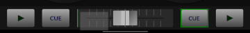
Drag and drop Simple rearrangements of a layout can be done via drag and drop. When you touch and hold a control in edit mode the app will hide the editor dialog and switch into drag and drop mode.  This is indicated by a green border around the selected control and a drag shadow being displayed that will follow your finger's position. This is indicated by a green border around the selected control and a drag shadow being displayed that will follow your finger's position.
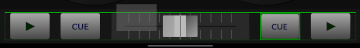
 When you move that drag shadow over other controls, a green line will indicate the point where the dragged control would be inserted if you took the finger off the screen. When you move that drag shadow over other controls, a green line will indicate the point where the dragged control would be inserted if you took the finger off the screen.
 When the shadow is moved close to a control's border that is off the axis of its enclosing group the insertpoint will change to 'before the group'. This is indicated by a dashed green line showing the insertpoint. When the shadow is moved close to a control's border that is off the axis of its enclosing group the insertpoint will change to 'before the group'. This is indicated by a dashed green line showing the insertpoint.
You can also drag and drop entire groups of controls after first selecting them as described above before performing the 'touch and hold' on the originally selected control. After a dragged control is dropped, the dialog will come up again. Drag and drop changes are not immediately saved. You will still need to 'OK' the dialog. If you click 'Cancel' instead, all uncorfirmed drag and drop changes will be reverted. Please note that drag and drop operation will quickly come to its limits when you try to find insertpoints between multiple nested groups. On small screens and when dealing with small controls it may also be difficult to see both the drag shadow as well as the indicators for insertpoints as they will likely be covered by your finger. All in all it is a bit questionable if this sort of operation really is suited to touchscreens at all (and I seriously doubt it). Using a mouse can raise the frustration bar eventually... Drag and drop on Android has some other limitations:
|
|||||||||||||||||||||||||||||||||||
|
Editor Tabs The editor dialog organizes control properties in four groups: Control types and basic behaviors are on the 'Control' tab. You define MIDI properties under 'MIDI', can label things on the 'Text' tab and set layout and color related attributes under 'Style'. The last tab - 'Presets' - is used to load overall controller definitions and import / export individual creations. Details are given behind the tab-header mock-ups below. 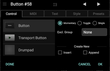 The Control tab defines the type of individual controls and some of their basic properties. The contents of the tab's right half will change depending on what type of control is currently edited, resp. what is selected in the list on the left.
Selecting a different control type in the list will exchange the currently selected one when you press OK. To create a new control instead of modifying the currently selected one, check either the "Insert" or "Append" boxes on the lower right hand side. This will show another popup that gives you the option to add multiple controls in one step. "Insert" means that new controls will be inserted right before the currently selected one. "Append" will add new controls at the end of the group the currently selected one lives in. New groups will be prefilled with default numbers of controls whose type you can select when creating groups. You can change their contents after they have been created. 🗑 - To delete a control, select the last - "None (Remove)" - entry in the list and click OK. You can also remove controls by dragging them off-screen, by using the 'Clear' entry in the editor's menu or by hitting 'Del' or 'Ctrl-Backspace' on an eventually connected keyboard. Control IDs: When you touch the 'Create New / ID" label, the Insert and Append checkboxes will be replaced by a textfield where you can assign an ID string to individual controls. IDs are not normally needed and TouchDAW mostly does not use any, but they become more relevant with adaptive layouts. IDs can be used with dynamic labeling (See 'Text') and to tie together hidden and shown instances of controls that are to represent 'the same thing', but need to be presented in completely different ways in landscape and portrait mode for example. Control specific properties: Properties are stored in xml attributes. Most controls will use a 'mode' attribute for the basic properties exposed on the Control tab. The attribute holds a numeric value that is interpreted bitwise, i.e.: the number really holds up to 32 on/off switches. The meaning of single bits may vary by control and is given in more detail below. As of version 2.4.0 the app will write 'mode' (and other bitmask values) in hexadecimal format, which can make it more easily readable. Values can still be given in decimal format, though. Most controls will also show a little + button on the control tab that brings up a popup menu with some less frequently needed options. Here you can set controls to be disabled initially, exclude them from snapshots, etc. A little tool to help figuring out bitset values outside of the app can be found below. Button:
Groups Groups are layout containers that define how individual controls inside them appear on screen. See the Style tab for details on group layout behavior. Besides plain layout groups there are some more specialized group types. Group types are mostly changeable without loosing content. You can turn a plain group into a scrollgroup etc. and the app will transfer the groups children and attempt to set some basic attributes needed in the new context (which may fail or at least not immediately meet your requirements at points). You can also 'turn' single controls into a group in case you realize you need more controls bundled with the first one. The result should then be a new group with the original control as its first and only child. To directly change a control into a group with different child types use the 'Change content' option. 'Change content' and 'Nr.Children' also determine how newly created groups will be prefilled and can be used to swap out all of an existing group's children. Leave the child count dropdown at its '-' entry to stick with the current number of child controls (when changing contents) or to prefill with some default value based on orientation and nesting level when creating new groups. Tabbedgroup: Tabbed groups create a tab for every direct child placed inside them and then show one of those tabs or pages at a time. Direct children to a tabbed group will usually be groups again, which then hold individual controls, but it is also possible to add controls directly. Default presets on the keyboard and XY-Pads screens, the 'Synth-Controls' and 'Alt-Keys' and other presets demonstrate use of tabbed groups. Newly created tabbed groups will be prefilled with two groups each holding a placeholder label. Tab titles can be given as a comma separated list using the 'Title' field on the 'Text' tab. Tabbedgroups can send MIDI in relation to tab selection and will switch tabs if they receive the MIDI they are set to send.
Scrollgroups allow for horizontally or vertically scrolling parts inside a layout. They will normally hold child controls directly and have the same prefill options as plain groups. Note that scrollgroups do not limit the size of what is placed into their scrollable viewport. Faders etc. will render at their 'preferred' aspect ratios and you may need to give absolute pixel 'width' or 'height' values (instead of a relative 'weight') if you want a certain number of them to be visible at a time. The 'MIDI Volume', 'NRPN' and 'Drawbars' and 'Sound / FX' presets show use of scrollgroups. A grid-controller sample with a vertical scrollgroup is available on the Presets page.
Grid: Special group that arranges its children in an evenly spaced grid. Used by the drumpad parts of the XY-Pads screen for example and featuring some conceptually related suboptions.
Sysex Group: Custom group type dedicated to manipulating fields in sysex messages. A Sysexgroup behaves like a plain group layoutwise, but isolates its children MIDI-wise. Instead of sending directly to the output port, contained controls will change single fields of a MIDI message assigned to the group and then send out that message. Some global properties are set on the group's 'Control' tab:
The MIDI attributes of child controls are used to program what field is manipulated in what way: The first 128 fields are addressed via MIDI Control Change (CC) messages. The controller number (1st data byte) sets the field number and the changing control's value will then be written to that position. You can limit (or window) the value range in the same way it works outside the sysex-group context. If you need to address fields higher than 128, use Aftertouch (128 -255), Note On (256 - 383) or Off (384-512) messages (Also see *). All other message types will not change the sysex, but are directly routed to MIDI out. The MIDI channel of child controls sets the 'format' of the value being placed into the sysex field(s):
There are two generic samples dealing with Roland's GS and Yamaha's XG standard available on the Workshop screen. Another visually more appealing sample that controls a Roland VM-3100 digital mixer can be downloaded from the Presets page. Even if you don't have a matching device, loading the samples, examining the controls' MIDI assignments and watching the generated messages in the MIDI monitor may help in understanding how this is supposed to work. Sysexgroups take up to three 'midi' attributes with the first one giving the message the group is working on, the second a device specific query message and the third one an eventually different feedback nessage from the external device. Only the first message is required. * If the sysex is shorter than the mentioned numbers, aftertouch and note messages go directly to MIDI out. This evtl. allows to place buttons etc. into the sysexgroup for layout purposes only The group's MIDI message does not essentially need to be sysex. You can use the same principles to change the parameter numbers in NRPN mesages, alter the MIDI channel of a single control etc.
CI Group: Custom group type implementing MIDI CI functionality. No further options. Group contents are built at runtime in response to property exchange communication. See the MIDI CI page for details. Controls taking multiple pointers: The following more complex controls make additional properties available through an in-control menu. They still use the 'mode' attribute, but will store things like scales and notelayouts, color schemes and sensors in additional attributes. The runtime menus will also contain mute controls for separate CC streams if any exist. You will need them for mapping. Mutes are not stored in xml. XY-Pad:
Keyboard:
Utilities and hardware access: Stepper: Steps through a value range given by the last byte(s) of its MIDI assignment, optionally showing a list dialog when the display is touched. Displayed values can be given a comma separated list in the control's 'title' attribute, with the first (and eventually only) entry serving as the dialog title. If not text is given plain numeric values will be shown.
Dropdown: Sends values corresponding to the selected index into its value range (given by the last byte(s) of its MIDI assignment). Entries in the dropdown list are created using text formatters. See the Control_Actions sample for an example. PC Keyboard: Gamepad: Mouse: TouchDAW 2.6 removes the global Keyboard and Gamepad mappers and instead makes HID peripherals available as controls that can be integrated into custom controllers. See the Map message type for programming them MIDI-wise. Gamepad and Mouse have a long-click option that brings up a dialog for stream muting and inversion. Inversion is stored in an xml 'inv' attribute. Mutes are for mapping external gear and are runtime only (For a permanent 'Mute' remove an axis's MIDI assignment).
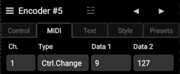
Snapshots: This is a readymade integrated control to take, recall and delete controller snapshots. It will paint as many buttons as it thinks will fit into the space it is given. The control is mainly thought to provide quick and easy access to the snapshot functionality. Probably not what you want to use in the end and rather to be seen as a temporary tool. See the snapshot sample available on the Workshop screen for other ways to take and recall snapshots. Snapshots generally store a control's current value(s) in a device-side database. Controls are referred to by either ID (if given) or by index (default). The index approach is easier in that it doesn't require any further preparations, but may produce unwanted results if a layout is changed after a snapshot has been taken. Controls can be excluded from snapshots with the 'No Snapshot' option available in the '+' overflow menu for most controls. Snapshot data is held in the database only as long as no other preset is loaded into a screen. If you want to keep snapshots of a layout, make sure to export it and use one of the 'bundle' options that will be offered when writing out the file. Snapshot in v.2.6 are static. Crossfading between them may come in future versions. Whenever the textfield on the right says "--default--", the attribute does not need to be given in xml at all (and TouchDAW would remove it). 0 or 0x0 can be a valid non-default value. 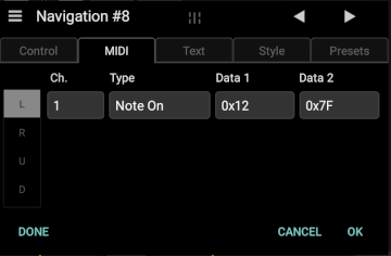 The MIDI tab defines the data sent by the currently selected control. Most controls will also react to the MIDI messages they are set to send.
The majority of controls will only offer a single 'stream' of data. When you edit a control that creates more than one, there will be a scrollable column at the left side where you can select the individual streams. The display format of MIDI data fields can be changed between decimal, hex and note name by touching the "Data..." labels above them. As of TouchDAW 2.6 assignable MIDI (& other) messages are grouped by basic characteristics. A two-page overview then calls up a dedicated subpage for the selected group. Some groups may be disabled at times depending on the edited control and stream (a fader can not play chords or switch app screens etc.). The Undo arrow button ⤺ in the upper right corner of subpages takes you back to the overview, where you can switch to some other message type or clear an assignment.
Subpages  The + and - buttons can be used to append a lower range byte or create running status combined multi-messages.  (MIDI 2.0 implements combined Bank & Program changes in the 'MIDI 2.0 Program Change Message')
 (MIDI 2.0 has its own messages for absolute and relative (N)RPNs)
 Sysex in MIDI 2.0 (at least the 7bit variant) is basically just a packaging specification. TouchDAW will send Sysex in UMP format when a MIDI 2.0 transport is used, but still expects the established F0 ... F7 format in MIDI assignments. The same is true for all System Realtime messages. MIDI 2.0 Sysex8 is NOT supported yet!
  UMPs with a MIDI 1.0 equivalent will be transformed when sent out over a MIDI 1.0 port. Those that do not have an equivalent will be lost.
MIDI 2.0's very long message type names would not fit into the UI and had to be abbreviated at points. A quick explainer:
 Attach standard DAW Control functions to a control. The displayed popup will contain commands depending on the app's "Sequencer" preference and the currently edited control type. Attach standard DAW Control functions to a control. The displayed popup will contain commands depending on the app's "Sequencer" preference and the currently edited control type.
DAW commands will always be sent out via the app's first MIDI port!  Make pads or buttons switch to other screens in the app or perform other internal things like bringing up the MIDI monitor. Make pads or buttons switch to other screens in the app or perform other internal things like bringing up the MIDI monitor.
   Exchange the currently loaded preset at runtime. This is deprecated. Do not use!. It will in most cases be smarter to make use of tabbed groups or switch to another app screen. Exchange the currently loaded preset at runtime. This is deprecated. Do not use!. It will in most cases be smarter to make use of tabbed groups or switch to another app screen.
 Contains a number of non-MIDI actions to change colors or text, store and recall snapshots etc. at runtime. Details on UI and data are given below Contains a number of non-MIDI actions to change colors or text, store and recall snapshots etc. at runtime. Details on UI and data are given below
Custom messages and MIDI hacks TouchDAW uses an internal non-MIDI format to encode functionality like 'DAW Control', 'App Navigation' etc. in 'midi' parameters. This generally uses a 0xFF value in byte number 0 as an escape character and then encodes actions and parameters in the following bytes with a subtype given in position 1. These options are now all editable via the GUI, but the 'Utils' and 'List' types may need some further explanation:
App specific messages with the initial 0xFF escape byte can and often will use all 8 bits of their message bytes. Despite being quite similiar to the sysex versions of some of these options (where MIDI principles dictate that only 7bits per byte may be used), their parameter fields will look different.
Beyond these extensions some valid advanced MIDI 1.0 features and inofficial hacks are programmable via the GUI or by editing 'midi' attributes in the xml: 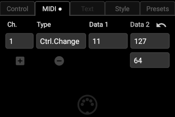
Lower range limit The last byte of a MIDI message will usually define a control's range. A fader with a 0xB0,0x07,0x40 MIDI assignment for example will only output values between 0 and 64 instead of the usual 0-127. With most MIDI messages you can define a lower range limit with another dropdown when you touch that + button underneath the channel control. Said fader would output values between 64 and 127 with the lower range set to 0x40. Codewise this just appends another databyte (i.e. 0xB0,0x07,0x7F,0x40), so it basically creates some 'invalid' MIDI. The appended byte will never make it to the output, though. The same option is available for some MIDI 2.0 UMPs where four extra bytes will be appended. Running Status If you touch the + again another dropdown will be shown. Instead of a lower range limit the controls now define index and value for running-status combined multi-messages. Running status was a MIDI 1.0 bandwidth saving measure, where the statusbyte is dropped on consecutive messages that would only repeat the last sent status. TouchDAW will allow you to add up to three additional messages to the original one here (More can be given in xml). A control can then for example send multiple CCs with a single touchaction, create chords from multiple notes etc.. Individual upper ranges given in '2nd' databytes are taken into account. A special case in this regard are CC messages of 5 bytes length using CC numbers that are 32 places apart and are below 64 (40h). The original MIDI specification defines CC numbers 32 - 63 as LSB controllers for CCs 0 - 31. A running status message like 0xB0,0x10,0x7F,0x30,0x7F will result in 'high resolution' (14bit) output with the upper 7 bits in position 2 and the lower ones in position 4. You can swap the controller numbers (ie make it 0xB0,0x30,0x7F,0x10,0x7F) to have the LSBs appear in the message first. Of course it will ultimately still be your screen, resp. the length of a fader that determines how high the resolution really will be. MIDI 2.0 unfortunately mostly destroys the simple, brilliant elegance of MIDI 1.0 and also does away with the running status concept. MIDI Learn 
You can let the currently edited control learn (standard) MIDI from the app's second MIDI port: When on the MIDI tab, touch the tab header again. The little white dot will turn red, the next MIDI received is set to be this control's MIDI data and MIDI learn is disabled again. If you touch and hold the tab header, learn mode will both be activated and set to automatically advance to the next control after something was learned in. The learned value will briefly be displayed before the next control is selected. After a successful learn operation MIDI input is also blocked for ~1sec to prevent note-offs or CC overturns from immediately being assigned to that next control. Touch the header again when done. Incoming velocity, CC and pitch values are 'ignored'. The learned MIDI message will represent channel, type and note / CC numbers of the incoming message, but have its value field(s) set to the 7 bit maximum.
MIDI Monitor  For debugging purposes you can call up a monitor overlay by long-clicking the edit menu button or by attaching an 'App Navigation / MIDI Monitor' action to a button. For debugging purposes you can call up a monitor overlay by long-clicking the edit menu button or by attaching an 'App Navigation / MIDI Monitor' action to a button.MIDI input received on the selected port will be displayed on the left. Data going out to that port is shown on the right. The overlay is semi-transparent and 'touch-through', components behind it will still be usable. If you need to scroll the monitor, it can be made touch-reactive via the two little arrows at the top. Please be aware that the monitor is a temporary tool and should not be mistaken as a UI component for controllers. It can have a bit of a performance impact with heavy input loads and its state will not be preserved across rotation and screen changes. Also note that with mixed MIDI 1 and MIDI 2.0 setups the monitor may not always be able to show what really goes out or comes in over a given transport. Data conversion may happen 'before' or 'behind' its insertion points. Use an external MIDI monitor or Wireshark in case you need a truely in-depth view of your data.  The Text tab contains an input field and some basic formatting options for controls that can show text.
Many controls have no way to show and / or format text and will have the tab or its components disabled or partially hidden. For those that do support text: Linebreaks are supported, the textfield will expand when you hit enter. Unicode symbols can be used by entering codepoints in "\u....", "U+...." or HTML entity ("&#x....;") notation. Availability and rendering of unicode glyphs depends much on system version and manufacturer preferences. For Transport buttons the text input may take a number between 0 and 11 as an index into standard transport icons. Labels, buttons, drumpads and encoders support dynamic text and can be relabelled at runtime either by Sysex, via Control Actions or by making use of some string formatting tricks that can make them act as labels or value displays for other controls (or for themselves): This is done by entering specifically formated strings into the "Title" field, defining a template string with an exchangeable field plus a reference to the control that shall update the field. For example: %03d/@sf0 - means: Let the control with ID "sf0" print its current value in decimal format into this label. The displayed number should always be at least three digits long. As you may notice, the command consists of multiple parts separated by forward slashes. The first one is the string template. It can just consist of the formatter itself, but may also look like: "Vol: %02X", which would result in the label showing "Vol: " followed by a changing 2 digit uppercase hex representation of the value to show. There is usually a ton of options with string formatters in programming languages, however TouchDAW currently only supports 'd' (for decimal), 'x' (for hex numbers) and 's' (for strings) and the minimum length option for numeric formats. 'x' and 's' can be given as 'X'" or 'S' to print results in all caps. To print values as percentages append two % signs after the number formatter (Two because % is a reserved character in this context. This is again just dictated by how string formatting works in programming languages). The second part of the example attribute above ('@sf0') holds a reference to another control. The '@' tells the app that the following is an ID string. A '#' would mean that it is an index. Indices are the numbers also shown in the Editor's header and should be handled with care (If you change your layout, control indices may change). ID strings can be given on the Control tab and you can use any string you want. Note that TouchDAW does not normally use ID strings and does not auto-assign any. The presets will normally use an abbreviation of the control type plus a number when making use of IDs ('sf0' then refers to the 1st small_fader). Finally there can be two more parts to the attribute: %s/@sf0/CC - here the 'CC' would make the app display the CC name or number instead of its value (ie. data 1 instead of data 2). %03d/#36/1 - the '1' in the last field gives a stream index. This would show a 3 digit decimal value of the second stream on control number 36. The default Keyboard layout makes a lot of use of this feature. Look at the labels' "Title" atrributes and the "ID" strings attached to faders and buttons to see how they are tied together. 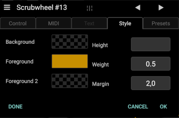 The Style tab controls color and layout aspects.
Colorfields set background and foreground colors depending on the type of the selected control. Not all controls will care for all three (or any) of the colorfields. Touching a colorfield brings up another dialog with a hue wheel, saturation, brightness and alpha controls. After adjusting your values touch the large circle in the center that displays the resulting color. You can also enter hexadecimal RGB color values in the dialog's header. To reset a color value to defaults, touch and hold the respective field. When editing a group or a label there will also be controls for selecting background images and editing their display properties. The right half of the tab contains layout parameters in a scrollable list. Most of these need not be set, but can be used to overwrite what the layout engine does without being given any hints. Some are only available for groups, some only for the top-level controller. Numeric values that reference 'Pixels' will be interpreted as 'device independent pixels'. Parameters showing a small bulleye symbol between name and textfield have a long-click option on the textfield, mostly giving access to frequently used values.
General notes on layouts: Do not expect to find anything like absolute position and size values! Layouts using fixed absolute values would immediately break the moment they are run on another device, because screensize, resolution, aspects etc. would very likely not match. Layouts rather work with a 'filling available space' concept and designing a layout will mostly be about arranging containers (ie.: groups) in a way that gives the actual controls the desired space. That said: Building an Android app normally requires to create multiple layouts for the same thing to account for all the different screens the app may run on. The system's internal mechanics then select the appropriate layout definition at runtime. Android's system-level layout engine however can only be used with definitions that have been precompiled into the apk. This is obviously not possible with user-defined layouts. TouchDAW's XML layouts therefore are built by the app's own layout engine, which replicates some concepts of the system, but in the end is very different and a lot less powerful. Amongst other shortcomings it lacks the ability to pick a screen-matching definition at runtime. When building a layout you should be aware that things may look a bit different when screensize, resolution, aspect ratio etc. change. As a rule of thumb, 'mixed groups' (groups containing different types of controls especially if those have drastically different aspect ratios like for example encoders and faders) should be avoided. You will otherwise likely need to adjust multiple individual layout attributes. Background Images Groups and labels can show .png or .jpeg image-backgrounds or use xml defined 'shapes' to create borders, gradients and fills. 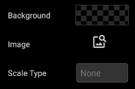 Images are a bit of a logistical nightmare, because external files need to be moved around with the xml. Also Android will not allow an app to load any old image from everywhere on your device without a lot of permission hazzle. TouchDAW will therefore only load images from its private storage space and copy everything that you import to that space before using it. When exporting controllers images and xml can be bundled in zip archives. Images are a bit of a logistical nightmare, because external files need to be moved around with the xml. Also Android will not allow an app to load any old image from everywhere on your device without a lot of permission hazzle. TouchDAW will therefore only load images from its private storage space and copy everything that you import to that space before using it. When exporting controllers images and xml can be bundled in zip archives.Touching the image-search icon will open a file-picker in the app's presets/img directory. This directory will be empty initially, but you can import files from the file-picker. See the files page for details. When an image has been selected it will replace the image-search icon and you can set some scaling options. To remove a background image, touch and hold its miniature view in the dialog. Keep your images at reasonable sizes! Bitmaps can take up a lot of memory and RAM-allocation failures may crash the app. It makes no sense to use a multi-megapixel shot from your camera roll as a background for some small subpanel (or even the whole controller)! Shapes Shapes are an Android concept to describe drawing commands via xml. TouchDAW currently only supports basic 'ShapeDrawables', but these can nevertheless offer a very economic alternative to bitmap images. To select a shape instead of a bitmap touch the 'Image' label. It will change to 'Shape' and touching the image-search icon will then take you to the 'presets/shapes' directory. Some example shapes are included. You can edit them from the file picker to adjust colors, line thickness, corner radii etc. See the comments in the xml and check the Android documentation on ShapeDrawables for more details. Shapes have no scaling option, because they are (mostly) resolution independent by definition.  The Presets tab contains a screen-specific list of presets. Some of them are ready-made controllers, some are mere templates that will need individual adjustments. All of them are customizable. The Presets tab contains a screen-specific list of presets. Some of them are ready-made controllers, some are mere templates that will need individual adjustments. All of them are customizable.Note that 'factory' preset listings are somewhat tailored to the initial 'theme' of the screen they appear on. The keyboard screen has mostly keyboard like presets, the XY-Pads screen offers presets replicating previous layout options (1 Launchpad / 1 XY-Pad, 2 Launchpads etc.). You will find the most extensive list of presets on the 'Workshop' screen, but these can generally also be used on all the other MIDI controller screens. Use the Export and Import controls in case you find something missing that is available elsewhere and to load user presets. After loading a preset by selecting it in the list and clicking OK (or by double-tapping the entry in the list) the controller definition will be merged into the current xml document and can be modified. The Import / Export controls on the right hand side can be used to save and load controller definitions outside of the context of the global setup file. These isolate definitions for the current screen and write / reload them without affecting the contents of other screens or any DAW control modifications you may have made. See the Files page for information on where the app stores its data. The file-dialog also lets you 'share' presets (export to a Drive instance, send out via email etc.) or import from non app-private folders, Google Drive etc.. Note that if you import a preset and then edit it, your changes will also be written back to the file originally imported. There is an option @ Setup /Global / MIDI Utilities that controls this behavior. Either turn it off or use the copy options on the filepicker to create explicit backups if needed!
Default presets for the individual screens are discussed on their respective manual pages, the Presets page has downloads for additional XML files not included in the app.  The Menu icon in the dialog's header ( ☰︎ ) gives access to some more functionality:
Primarily it offers some basic copy / paste and delete functions that work in context of the current tab. When you go to the menu on the 'Control' tab you can use them to copy controls or groups and paste them to some other place ('Paste' will again insert a copy before the currently selected control). On the 'Control' tab 'Paste' will also offer to paste only the attributes of the copied control as shown in the screenshot. The 'Clear' option can be used to remove controls from the document. On all other tabs the three options always only work on 'attributes', i.e. they assign a control's MIDI or color settings to the one you invoke 'Paste' on and do not create new controls. The gear icon will show some editing related preferences. If there are 'emulation' nodes inside the controller definition or globally in the document, touching it again will show a list of queries and responses with a checkbox to individually (de)activate them. |
|||||||||||||||||||||||||||||||||||
|
XML Editor While controllers can be fully edited via the UI, it may at points be faster and more convenient to work directly on the xml. The app's internal XML editor is little more than a standard Android text editing component with the usual touch-based selection, copy / paste, deletion options. If a hardware keyboard is connected those will also be available via standard keyboard shortcuts (Ctrl-c, Ctrl-v etc.). Additionally there will be some extra key commands:
XML Attributes List of attributes used on pad and control nodes:
|
|||||||||||||||||||||||||||||||||||
|
Shortcomings Things that are currently NOT possible:
|
|||||||||||||||||||||||||||||||||||
|
|
|||||||||||||||||||||||||||||||||||
 Some multi-message hacks as detailed in the following table
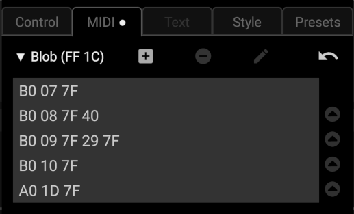
 This is a special list type message used only with
 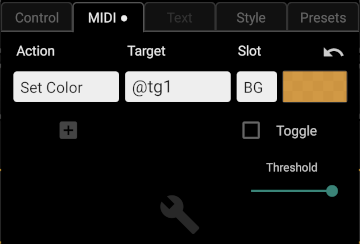 This group holds some utilities that can be used to change text, colors, visibility etc. of individual controls at runtime. They are generally defined by a 'sub subtype', followed by a target address and some message specific data and can now all be set up in the UI. Control actions can generally be combined with regular MIDI messages in the 'List' type message described above. See the
  This can be used to define under which conditions a control or group will be shown. The three columns allow for 'binary' combining conditions following logical AND, NOT and OR rules: